Journal
- 2025
- March
- February
- 2024
- December
- September
- August
- May
- 2023
- September
- August
- March
- 2022
- December
- October
- September
- August
- July
- June
- May
- April
- February
- January
- 2021
- November
- September
- August
- June
- May
- April
- March
- February
- January
- 2020
- December
- August
- July
- June
- May
- April
- March
- February
- January
- 2019
- December
- November
- October
- September
- August
- July
- June
- April
- March
- February
- January
- 2018
- December
- November
- October
- September
- August
- July
- June
- May
- April
- March
- February
- January
- 2017
- December
- November
- October
- September
- August
- July
- June
- May
- April
- March
- February
- January
- 2016
- December
- November
- October
- September
- August
- July
- June
- May
- April
- March
- February
- January
- 2015
- December
- November
- October
- September
- August
- June
- April
- 2014
- October
- September
- July
- June
- May
- March
- February
- January
- 2013
- November
- September
- August
- July
- June
- May
- April
- March
- February
- 2012
- December
- November
- October
- September
- August
- July
- June
- May
- April
- 2011
- December
- October
- September
- 2018 trends (4)
- 2021 Trends (2)
- 2022 trends (1)
- 2023 trends (3)
- accent room (1)
- accessories (2)
- amy schuermann interiors (27)
- amy youngblood (1)
- amy youngblood interiors (42)
- Amy Youngblood Interiors (22)
- amy youngblood schuermann interior designs (2)
- Amy Youngblood Schuermann Interior Designs (1)
- art (8)
- art deco (6)
- artwork (1)
- atmosphere (31)
- awards (3)
- ayi team (6)
- back to school (3)
- basement (1)
- bathroom (4)
- bathroom organization (1)
- bedroom (5)
- bench seating (1)
- BLING Boutique (1)
- bold (6)
- brass (1)
- budget (1)
- Built-ins (1)
- channel 9 (1)
- children's room (2)
- christmas (9)
- cincinnati (16)
- Cincinnati (2)
- Cincinnati full-service interior design (1)
- Cincinnati Home (5)
- Cincinnati interior design (1)
- Cincinnati's best interior designer (1)
- cincy lifestyle (2)
- Cincy Lifestyle (2)
- classic design trends (5)
- color (3)
- color trends (14)
- Color trends (1)
- commercial design (4)
- commercial interior design (1)
- concrete (1)
- condo (1)
- COVID (1)
- cozy (9)
- cubbies (2)
- custom (1)
- custom design (4)
- custom window treatments (1)
- decor (35)
- decorating (5)
- design (29)
- designbuildcincy (2)
- Dining table choices (1)
- dramatic (3)
- durability (4)
- eco-friendly design (2)
- elevate (1)
- entertaining (22)
- entertainment (3)
- entry rug (1)
- entryway (7)
- environmental design (2)
- event (1)
- events (20)
- fabric (4)
- fall (14)
- fall interior design trends (1)
- family room (3)
- fashion (2)
- Female Business Owners (1)
- fire pit (1)
- fireplace (1)
- flowers (1)
- functional (4)
- Furniture (3)
- Gallery Wall (1)
- gallery wall (1)
- garage (1)
- gifts (1)
- granite (2)
- green design (3)
- guest bathroom design (1)
- guest bedroom (1)
- Halloween (1)
- hearth room (1)
- high point (2)
- holiday decorating (1)
- holiday planning (11)
- home office (2)
- home renovation (38)
- Home Renovation (4)
- hospitality design (1)
- houzz (1)
- how to get started (25)
- How to get started (2)
- hyde park (5)
- hygge (1)
- Indigo Hippo (1)
- indoor plants (3)
- inspiratiom (3)
- inspiration (89)
- interior design (118)
- Interior Design (3)
- interior design mistakes (1)
- interior design project (1)
- interior design trends (46)
- Interior Design Trends (1)
- junior league of cincinnati (2)
- Kids Bathroom (1)
- kitchen (7)
- Laminates (1)
- LEED (1)
- LEED Design (1)
- light fixtures (6)
- lighting (13)
- lighting design (1)
- Live in the Movement (1)
- living room (5)
- marble (1)
- marketing (1)
- metallics (7)
- metals (2)
- midcentury modern (6)
- mood (2)
- mt.lookout (2)
- mudroom (2)
- natural (7)
- nature (8)
- Nature (1)
- neocon (1)
- neutral (9)
- Neutral (1)
- nonprofit (2)
- office (3)
- office design (1)
- office space design (2)
- open concept (1)
- organization (11)
- organize (2)
- otr (1)
- outdoor (9)
- Outdoor design tips (2)
- outdoor furniture (2)
- outdoor interior design (3)
- Outdoor kitchens (1)
- over the rhine (1)
- paint (11)
- paint colors (1)
- paint trends (1)
- palette (13)
- party (9)
- patio (7)
- pattern (8)
- Pelle Medical Skincare (1)
- personal training (1)
- philosophy (3)
- Philosophy (1)
- pillows (2)
- plants (2)
- pop of color (2)
- powder room (2)
- powder room design (1)
- project management (1)
- projects (4)
- publications (9)
- quality furniture (1)
- quartz (2)
- Quartz (1)
- reclaimed wood (1)
- relax (1)
- remodel (1)
- remodeling (9)
- remote learning (1)
- remote learning design solutions (1)
- renovation (12)
- residential design (9)
- residential interior design (4)
- restaurant (1)
- restaurant design (1)
- retro (2)
- rug (3)
- rugs (3)
- semi-open floor plan (1)
- space planning (4)
- spring design trends (3)
- Spring Design Trends (1)
- stone (1)
- storage (11)
- style (67)
- Style (2)
- summer (1)
- summer design (1)
- summer outdoor entertaining (4)
- sustainable (1)
- terrazzo (1)
- texture (2)
- thanksgiving (4)
- tile (4)
- tour of kitchens (3)
- travel (1)
- trends (39)
- unique (3)
- unique design feature (1)
- wallpaper (11)
- walnut hills (1)
- window treatments (2)
- winter (6)
- wood (2)
- wood flooring (4)
- world travels (1)
- yellow (1)
8 Common Interior Design Mistakes
There are a great deal of faux pas that designers often see homeowners making, so in order for you to avoid them, here is a list of 8 common interior design mistakes we see and how to avoid them.
-
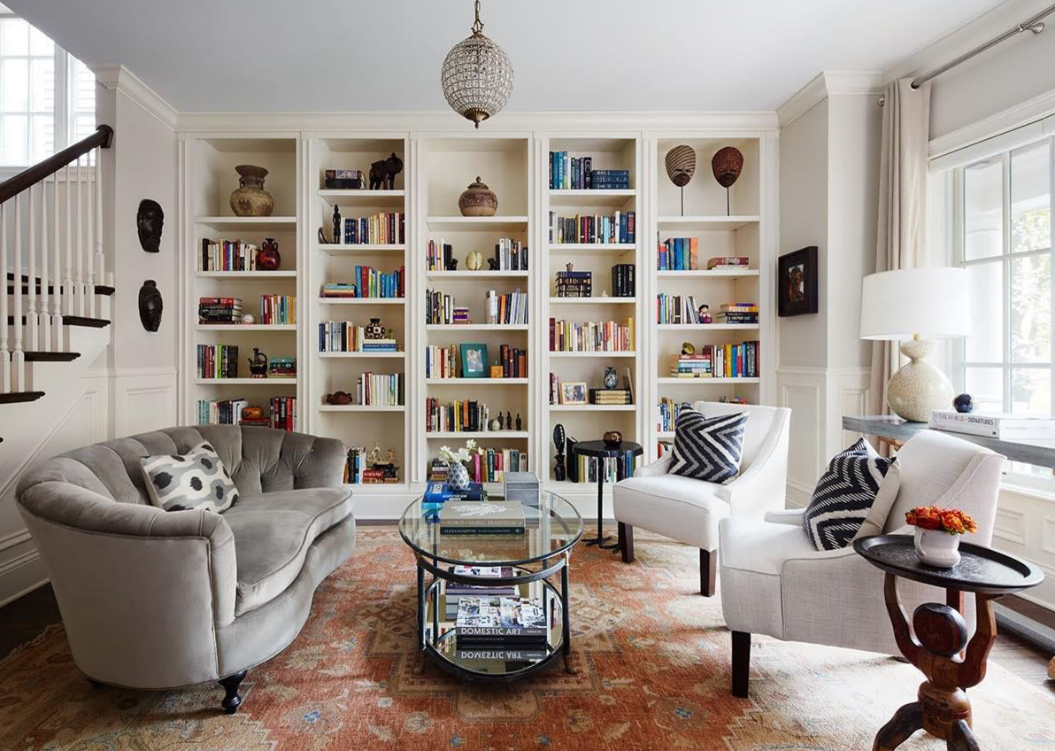
Rooms that are Overly Coordinated : Spaces that are too synchronized, with all new furnishings or store bought pieces can create a mundane atmosphere. Your home is a space for personal expression, so your personality should show through. Spice up your space by displaying items you’ve collected from your travels or showcasing antiques that have been passed down through your family in addition to your new pieces.
-
Small Scale Furnishings in Small Spaces : The bathroom is a common place that fails to utilize the entirety of the space. If you have a small bathroom, don’t put in a small vanity. This minimizes usability, but it also highlights the size of the room. Instead, use a monochromatic color scheme with a custom vanity that is fit to your space. This will make your space appear larger and allow for greater functionality.
-
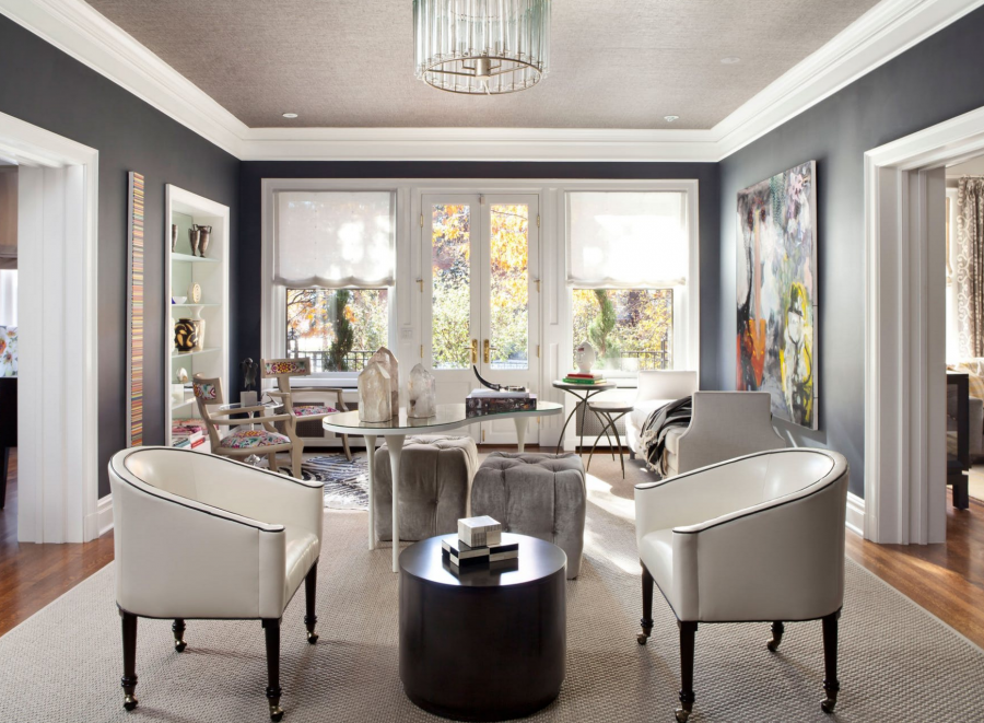
Over Accessorizing : The use of too many accessories is one of the most common design mistakes designers see, which is especially true for spaces with multiple functions. Each room should have a space that allows the eye to rest. Be selective with your accessories, but choose pieces with lots of personality to make a small statement.
-
Sticking to Only One Style : Another common mistake is sticking to a single design style or letting your home dictate your design style. A traditional home does not necessarily need traditional furnishings and accessories. It is great to mix up styles and combined transitional and contemporary pieces with traditional ones. Don’t be afraid to keep an antique desk, just pair it with a sleek leather chair.
-
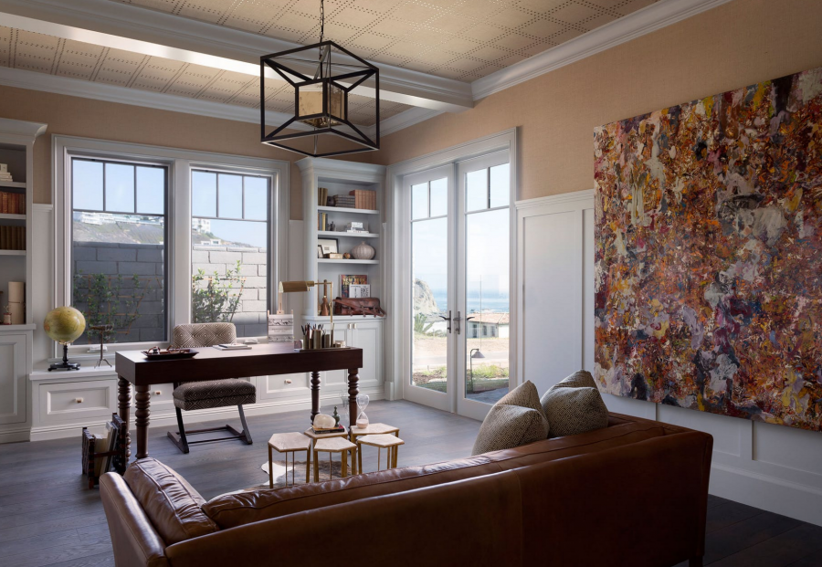
Misplacing Artwork : Many individuals are afraid to incorporate artwork into their spaces due to not knowing where to place them. Artwork does not need to line up perfectly with your window or door frames, often times placing an art piece a few inches below and above the trim is the best placements. Artwork also doesn’t have to be small. If you happen to come across a large and striking piece that you fall in love with, find an empty wall in a living or sitting room and make that piece the focal point of your space.
-
Minuscule Lighting Fixtures : Another common design mistake is choosing the wrong size chandelier, whether is it too small for a large foyer or too large for a dining room. When selecting a fixture it is important to keep in mind the size of the space, the ceiling architecture, as well as the spaces furnishings. It’s often better that your fixture is too large rather than too small.
-
Windows Made to Look Too Small : Often times, the windows on a homes exterior scale properly with the home, however, on the inside, the windows appear too small. One easy way to make your interior windows appear larger is through the use of window treatments. Installing drapery hardware at a maximum height, a few inches below the ceiling or molding, will ensure that your windows look larger than they actually are.
-
Letting on Piece/Item Dominate : Having a focal point in your space is key, but you don’t want it to be too dominating that it’s the only element of the space that you see. You want to make sure that you correctly balance out all aspects and features in your space to create a coherent and seamless looking design.
So, there you have it: some of the most common mistakes designers see homeowners making. Now that you are aware of these faux pas you can be sure to avoid them! And if you're still unsure, don't hesitate to contact us at Amy Youngblood Interiors!


